What does a pollen season look like?
Plants release pollen in a phenological process : the pollen season. As pollen allergy suffers know, these seasons repeat every year in a similar way - but there is also great variability, at the level of daily observations, between seasons and between plants. This post presents ways of visualising pollen time-series data so to gain a sense of how a pollen season unfolds as well as how pollen seasons vary.
Pollen concentrations vary from day to day. On the left are daily observations of the concentration of birch pollen in 2006. It starts in mid-April, it fades out from mid-May. The bulk of pollen is seen in the second half of April. This is the main pollen season: people allergic to birch pollen will see strong symptoms when the concentration is above 50 or 100 pollen grains /m³.
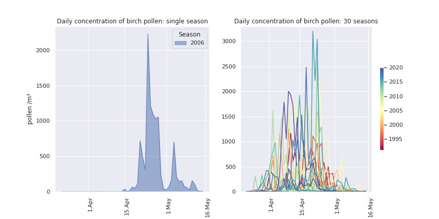 But pollen concentrations are also vary from season to season. On the right are daily concentrations of 30 seasons of birch pollen. Each season happens around the same time of the year, but the day-to-day variability as well as the season-to-season variability are considerable.
To smooth the daily variations out, we can use rolling averages. Below are 10 randomly selected seasons, showing the rolling mean, averaged over different-sized windows.
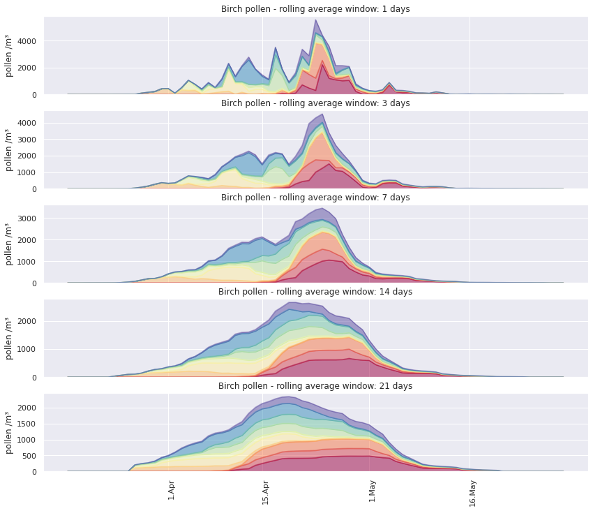
Using a rolling average makes the visualisation less busy, and gives a better sense of the intensity of the main season, as well as the differences between seasons.
But if the interval over which the rolling average is calculated becomes too long, the granularity of daily observations is lost. As peak days get flattened, the coloured area is primarily a visualisation of the start and end of the seasons, as well as the amount of pollen released in total.
A second way of making the graph less busy is to use the cumulative sum of daily pollen concentrations. This is shown on the left for the same 10 seasons as above.
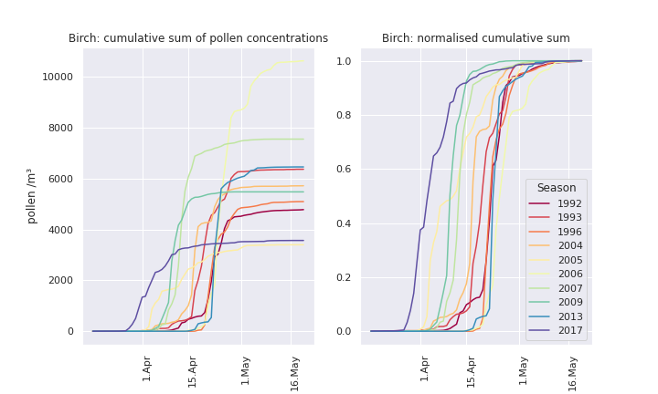
The cumulatively summing the daily observations gives an even better sense of the differences in timing between seasons, and the total pollen released each year. The granularity of daily obervations is not lost, but shown in context.
If we normalise the cumulative sum, we get a sense of how similar the unfolding dynamic of each season is: though each season starts at a different time, once the birch trees get going, they release a lot of pollen in a short time. With trees like birch, we usually pass fom 20% to 80% of a season’s total pollen in very few days.
However, even the normalised cumulative sum can be too busy if we want to look at the decades of pollen measurements in the dataset (LHS and middle panels below). So here’s one of my favourite ways of visualising pollen season : the functional boxplot (RHS panel).
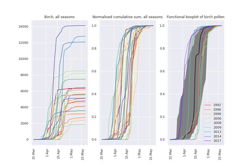
In the functional boxplot, the thicker black curve is a ‘median’ curve that summarises all the seasons. The dark grey central region includes 50% of pollen observations.
Outlier seasons are shown individually. Notice something? the ‘too late’ outliers are mostly in the 90s and 0s, the ‘too early’ outliers are mostly in the 2010s. More on that another time.
What happens if we combine rolling means and functional boxplots? The figure below shows how a very busy visualisation of 30 years of daily grass pollen concentrations can be cleaned up, first by calculating a rolling average, normalised using the median season total.
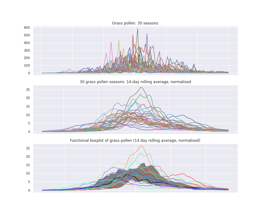
The lower panel represents the same data as a functional boxplot, emphasising the region containing 50% of observations (grey), and outlier seasons. This is without using cumulative concentrations. It works best for grass pollen, which have quite a long, less variable season.
So to summarise:
- rolling averages are a good way of smoothing out daily variability ;
- cumulative sums are good for visualising the progression of a dpollen season ;
- normalisation of cumulative sums is best for comparing season progression and timing - especially in a functional boxplot.
What if we combine all of these methods from our box of tricks?
Let’s first visualise all the tree pollen seasons:
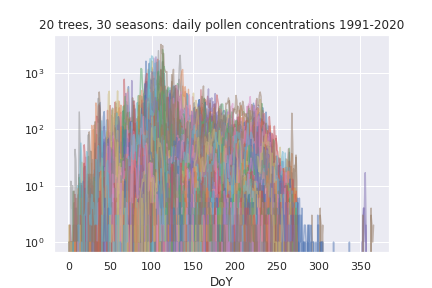
That’s daily observations of 20 species over 30 years, so 600 seasons. The daily observations vary over 3 orders of magnitude of pollen concentrations. Quite a muddle!
Now here’s what happens if we separate the same data by plant species, and use rolling means, cumulative normalised sums with functional boxplots.
This way we can visualise when each tree pollen season normally occurs, as well as the seasons that were different from that norm.i87
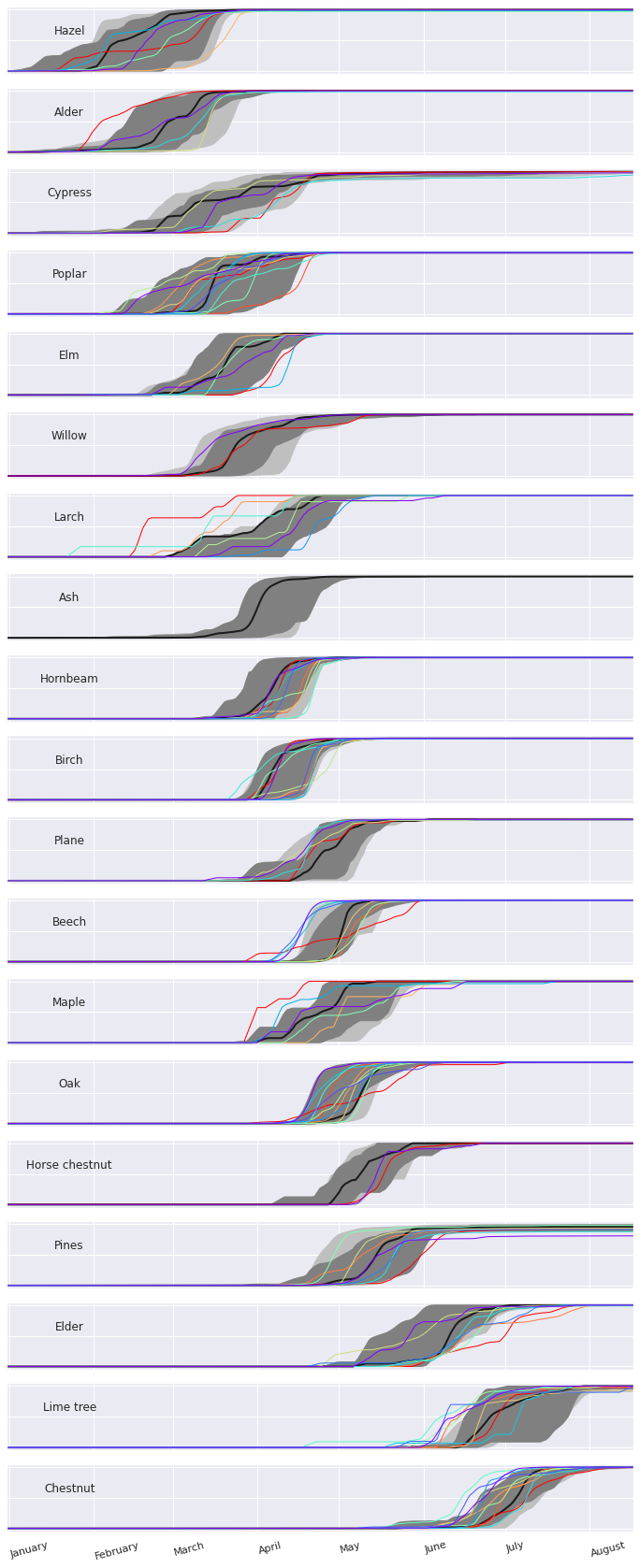
And there we have it: order from chaos, an intuitive understanding of 600 tree pollen seasons, 30 years worth of observations made at a daily frequency.