Data visualisation: P2P lending and the credit crunch
Peer-to-peer lending is an alternative finance facility that developed from the mid-noughties. How is it used by lenders, and does it help them deal with financial issues they face?
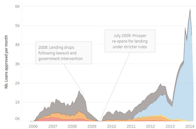
To look into this topic, I used visualisation in Tableau of large data set of loans from the P2P lending company Prosper.

My particular interest was how the period of the 2008 financial crisis shaped P2P lending, and how lenders used this banking alternative.
The credit crunch posed additional economic hurdles for lenders shut out from the traditional financial institutions - was there evidence that it enabled them to successfully overcome these?
How did the changing regulatory framework affect how P2P lending worked?
Project purpose
The purpose of the project, which is a part of the Data Analyst course I did, was to practice story telling using data visualisation.
I analysed a data set and created an explanatory data visualization. Upon feedback from 2 people, changes were made to optimise communicating a clear finding. The final deliverable was the visualisation workbook along with a write-up documenting changes made after feedback.
Tools and data set
The software I used both for analysis and visualizations is Tableau. Tableau makes available a platform to explore, create and publicly share data visualizations online called Tableau Public.
The dataset I chose about P2P lending contains information from Prosper for the years 2005-2014.
This dataset contains data about 113,937 loans with 81 variables on each loan, including loan amount, borrower rate (or interest rate), current loan status, borrower income, and many others.
Files and Links
- The final report: Pdf file hosted on Github
- The first version of the Tableau story: Story hosted by Tableau
- The final version of the Tableau story with improvements after feedback: Story hosted by Tableau
- Dataset used - Prosper P2P loans: https://s3.amazonaws.com/udacity-hosted-downloads/ud651/prosperLoanData.csv.
- Explanation of the variables used in the Propser dataset https://docs.google.com/spreadsheets/d/1gDyi_L4UvIrLTEC6Wri5nbaMmkGmLQBk-Yx3z0XDEtI/