Exploratory Data Analysis in R: US presidential campaign donations 2016
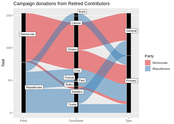
The 2016 election victory of Donald Trump shook many people’s beliefs about US democracy. The media commonly portrayed this upset as a popular revolt by disadvantaged voters against a liberal political elite. But is this narrative backed up by data such as election campaign finance donations? Who financed this popular revolt?
I used a data set of campaign donations published by the US Federal Election Commission
to explore and visualise trends of the primary as well as general election compaign donations.

Project purpose
The aim of this project was to learn how to use R for data cleaning and EDA. It is a part of the Data Analyst course I did.
More specifically, it was about discovering relationships among multiple variables, and creating explanatory visualizations illuminating distributions, outliers, and anomalies.
The suggested structure was
- a stream-of-consciousness exploration of the data, using univariate, then bivariate, and finally multivariate plots ;
- A selection of the 3 most interesting plots and a summary
- A final brief reflection about the struggles, successes encountered and ideas for future exploration
What interested me most in this exploration of a rather complex data set was if I could find any indications of the November “revolt” in the data.
Data set
A data set of all campaign donations was obtained from the website of the Federal Election Commission.
The FEC is tasked with enforcing campaign finance law in US federal elections, which includes the disclosure of campaign finance information.
1.4 GiB .csv file I dropped a number of records and variables that were not used in the analysis. This included records of returned donations.
After cleaning, the data set I used consisted of 7.3 million finance contributions, with 10 variables.
Tools: R for EDA
I installed R from the Comprehensive R Archive Network (CRAN) and R Studio
Packages installed include ggplot2, knitr, dplyr, reshape2, as well as some packages for more specialised visualisations such as the alluvial (ggalluvial) and tree map (treemapify) graphics.
The RMD file containing the analysis and visualiations was knitted into an html file using knitr to produce the full analysis document which is available here.
links & files:
- local link: knitted rmd file