How to find a needle in the haystack, using z-scores and Q-Q plots
Outliers caused by typos can profoundly distort a dataset if they generate an impossibly large or small value. The same property also makes them easy to identiy during data cleaning.
But what if a typo in a time-series is exceptional not due to its value, but due to the time when it occurs? Such small errors can be hard to identify, especially in a time-series such as 30 years of daily pollen counts. In this post, I show an approach I used for finding the needle in a haystack - or a handful of pollen grains outside of the hayfever season.
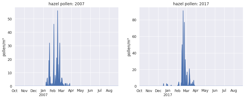
Plants release their pollen at quite specific times of the year. Hazel, for example, pollinates in the winter months: in 2007, hazel pollen irritated the allergy sufferers between mid-January and mid-March.
Of course there will be some occasional pollen grains before or after that typical time - there are always variations between seasons -, but we don’t expect to see hazel pollen in summer or autumn.
So how come hazel pollen was detected in August 2017, as well as October and November 2016? How plausible or implausible are these observations?
Hazel pollen in the summer ?
To look more closely into this, let’s visually compare the 2017 season to other hazel pollen seasons in the same decade.
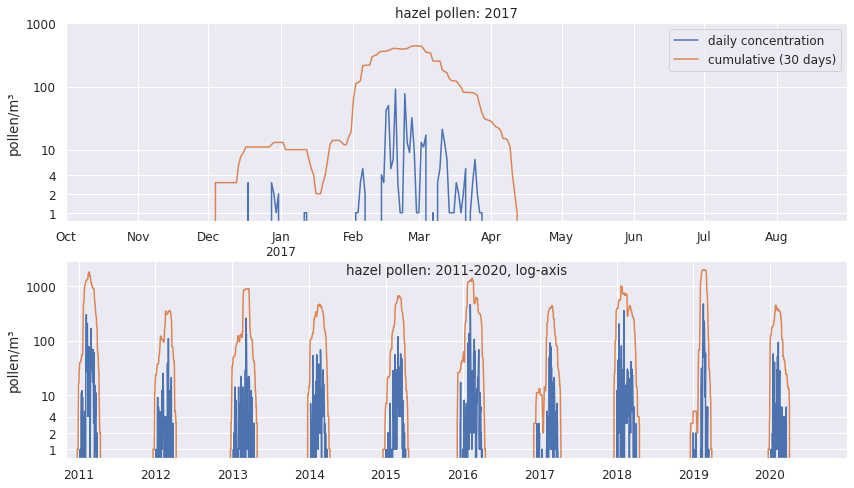
Here I’m adding a 30-day rolling sum (orange line) to show when the main pollen season happens, and I use a log-axis to emphasise single-digit pollen concentrations.
This shows more clearly how out of place the pollen grains in October and August are - in 10 seasons, this only happened once.
A bit of botanical knowledge is extremely helpful here: Hazel pollen is produced in catkins, which start their development in the summer, and mature in October-November.
In fact, hazel catkins usually need a cold period before they start producing pollen. So unless a strange mutation has occured in nearby hazel bushes, observations of hazel pollen in August and October are likely erroneous.
Even if these observations are real - perhaps months-old pollen was re-suspended in the air from leaves or old catkins that were disturbed - they are not helpful if we want to analyse and model typical hazel pollen seasons, and removing these data points is warranted.
Although it’s just a handful of pollen grains, in the wrong place they can seriously distort our descriptive metrics of pollen seasons.
A hazel pollen season usually lasts for around 60 days (if defined as the duration from the 1. until 99. percentile of a season’s pollen). So if the start of the 2017 season is determined erroneously to take place in October 2016, and the season end in August 2017, then the duration would be 10 months rather than 2. Such typos can result in grotesque outliers.
standard scores
if we knew the distrubution, we could calculate the probability of obtianing a particular z-score. In the p[resent case, we don’t care: we just want to check if the most unlikely ones are fine.
How can we ensure such outliers are detected? For the main 6 types of allergenic pollen in the dataset, there are 10885 daily observations, with 431762 pollen grains over 10899 days - finding handfuls of pollen grains in the wrong time of the year is about finding needles in haystacks.
I used an approach of identfying the pollen seasons with the least likely characteristics, and then spot-checking the individual daily observations which the season characteristics were based on to see if they are compatible with botanical knowledge.
After calculating a bunch of descriptive metrics for the 30 seasons in the dataset, I converted these to z-scores, aka standard scores.
Each z-score tells us how many standard deviations that season metric is away from the mean of the 30 seasons. So if we look at the z-scores with the largest absolute value, we can quickly identify the most unusual ones.
And if the same season is unusual for several metrics, it’s worth checking if it genuinely was unusual or if something’s off.
These are the 20 largest z-scores:
| pollen_type | metric | year | z-score |
|---|---|---|---|
| Alnus | season_total | 2016 | 4.158800 |
| high_pollen_days | 2016 | 3.978652 | |
| Corylus | median_count | 2011 | 3.952323 |
| moderate_pollen_days | 2018 | 3.462771 | |
| last_pollen | 1993 | 3.197012 | |
| Alnus | first_pollen | 1991 | 3.185730 |
| Corylus | high_pollen_days | 2011 | 3.151175 |
| last_pollen | 1992 | 3.082012 | |
| tr20_end | 2008 | -3.010488 | |
| tr3d20_end | 2008 | -3.010488 | |
| Betula | tr30 | 1998 | 2.855324 |
| first_to_last | 2009 | -2.815287 | |
| Corylus | tr30 | 2018 | 2.804770 |
| Alnus | peak_value | 2019 | 2.796124 |
| Betula | trmov5_11_start | 1996 | 2.705589 |
| median_count | 2006 | 2.681453 | |
| Corylus | first_pollen | 1991 | 2.659328 |
| Betula | season_total | 2020 | 2.648397 |
| Alnus | median_count | 2016 | 2.636155 |
| allergy_period | 2018 | 2.632686 |
According to the empirical rule, just 0.3% of z-scores should be greater than +3/-3 if the distribution is Gaussian. Pollen season metrics typically dont have a Gaussian distribution, but we can rely on Chebyshev’s inequality according to which at the very most 11.1% are expected to have a z-score greater than 3/-3.
The largest z-scores for hazel (Corylus) are all linked to the 2017 season, which we’ve looked at already.
Cleaning birch pollen seasons
For birch (Betula), the seasons 2018, 2005,1992 stand out. Let’s check them out!
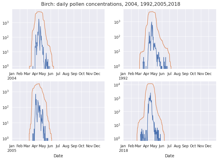
2004 is a typical season - this is our ‘control’. The handful of September birch pollen grains in 1992 and 2005 are exceedingly implausible.
The 2018 pollen grain recorded in February is even more implausible: birch catkins only start their development in March, so they aren’t producing pollen in February.
Cleaning grass pollen seasons
The most unusual grass season metrics are associated with the year 2007:
| pollen_type | metric | year | z-score |
|---|---|---|---|
| Gramineae | trmov5_11 | 2007 | 3.344516 |
| duration_2p5to97p5 | 2007 | 3.084482 | |
| duration_eaaci | 2007 | 2.859359 | |
| tr3d20_start | 2007 | -2.791684 | |
| tr20_start | 2007 | -2.791684 | |
| tr30_start | 2007 | -2.718110 | |
| trmov5_5 | 2007 | 2.703028 | |
| moderate_pollen_days | 1998 | 2.667299 | |
| start_5pc | 2007 | -2.653617 |
Let’s look at the 2007 pollen concentration data in the context of nearby seasons, as well as a more detailed view of daily observations:
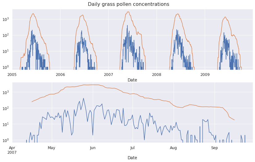
Though it may have started a bit earlier and lasted a bit longer, the 2007 does not look fundamentally different from others, and the daily counts look fine.
There is no reason to suspect erroneous data - 2007 was probably just the longest season in the 1991-2020 period.
Cleaning alder pollen seasons
How about alder (Alnus)? The 2016 season had high z-scores for the total amount of pollen produced in the season, and the number of days with especially high pollen counts.
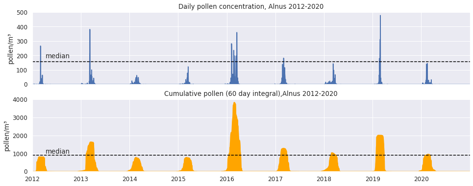
The 2016 season was definitely unusual: the total amount of pollen produced on average (median) is below 1000, but in 2016 it nearly reached 4000 pollen grains/m³ per year.
But the 2016 peak concentrations aren’t unusually high - ie. not the type of outlier due to a typo.
In fact, it looks like in 2016 the period with days where pollen concentrations stayed relatively high was unusually long, while for the other seasons, this period is much more transient and tails off quickly.
So 2016 doesn’t look like an outlier that should be removed - quite the opposite, we might want to study it closely, to learn something about the factors associated with high seasonal pollen totals.
Quantile-quantile plots
Quantile-quantile (Q-Q) plots are a quick graphical method for comparing two distributions: if the two distributions corrrespond to each other, the quantiles from one plotted against the other will follow a 45° diagonal line (y = x).
Often a set of actual observations (y axis) is compared to a theoretical distribution such as the normal disrtibution (x axis).
Such a normal quantile plot shows how much the distribution of the observed data follow or deviates from the Gaussian.
A strength of normal quantile plots is that data points in the tail of the distribution are much better visualised - of course this is where we expect to find outliers.
I like normal quantile plots because of the intuitive understanding they give of a dataset. The central tendency, variability and skewness are instantly visualised.
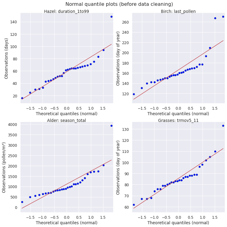
In the present case, I don’t necessarily care whether a pollen season metric follows a Gaussian distribution specifically, but about quickly identifying if the extreme data in a normal quantile plot look like potential outliers : do they fall close to the 45° diagonal line? If not, do they deviate in a way similar to the other observations?
This is quite similar to the strategy of using z-scores to identify unusual observations that are worth checking. The advantage of the normal quantile plots is that potential outliers are shown in the context of the other 29 seasons.
In the 4 normal quantile plots above, each has one or two data points that look unusual. From our previous inspection of the underlying pollen counts, we can be confident that only the top row (hazel season duration, birch date of last pollen) is due to erroneous pollen data. The bottom row (alder season total, grasses season duration using moving averages) are genuine data points that are unusual due to “freak events”, in this case probably unusual weather or mast seeding years.
What this shows is that it is usually not enough to just look at how extreme a data point is, some domain knowledge is required to make a judgement as to which data points are unusual and which are impossible.
Outliers distort outlier detection methods
What is the effect removing the implausible observations by setting the value of the pollen concentration to 0? Here are normal quantile plots for before/after cleaning (blue/red). The top row shows the actual values of the observations on the y-axis, the bottom the corresponding quantiles.
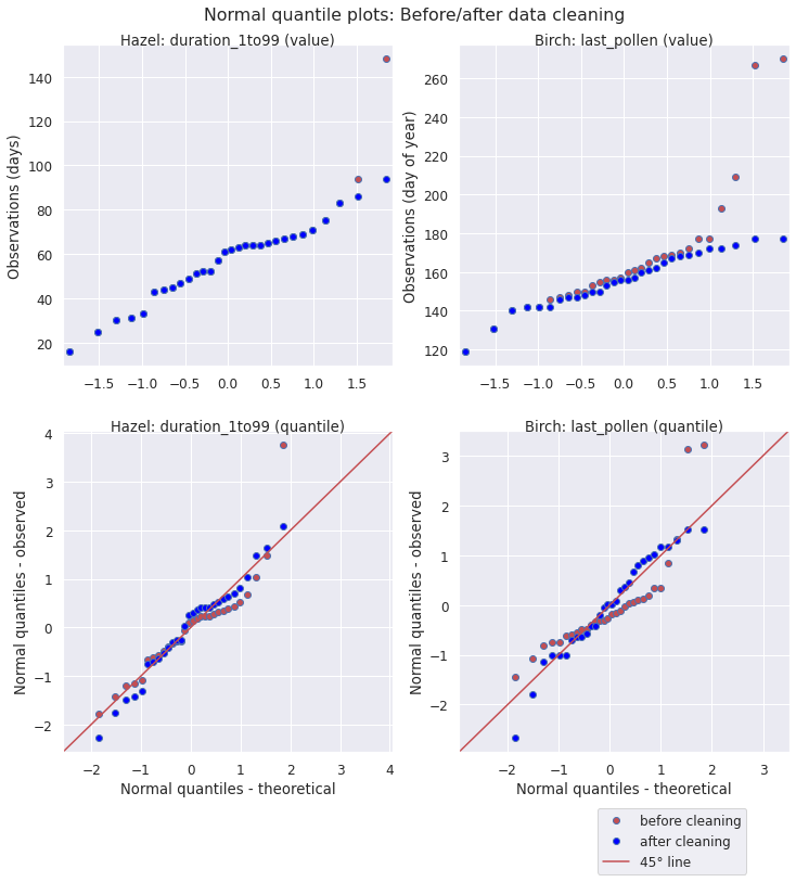
For the duration of the hazel season (1-99% of APIn), cleaning corrects two extreme data points, while the other values remain the same. In the bottom row we can see how correcting the outliers impacts the shape of the whole distribution: it follow the 45° line representing the Gaussian more closely.
For the end of the birch season (last day of the year with birch pollen), cleaning corrects a handful of data points. Some of these end up closer to the median of the distribution, causing the cleaned distribution to shift to the right. Again, as shown in the bottom row, after data cleaning the data points follow a normal distribution much more closely.
The impact of the removal of erroneous pollen data on the whole distribution shows another noteworthy - and slightly ironic - phenomenon: most methods for outlier detection are themselves sensitive to the presence of outliers.
In other words, the presence of outliers make other data points look less unusual than they are, whether we use their z-score or their position in the context of the whole data set on a normal quantile plot.